This is my first post in english. If you find any errors, or if you can't figure it out, please let me know.
Back in 2011, browsers started to implement CSS shorthand filters from the Filter Effects specification. Basically, at this time, only SVG filters were supported, and Firefox was the only browser that can apply them to HTML content (it's mainly still the case).
CSS shorthands filters, like blur(), contrast() or grayscale() are a great addition to CSS, even if SVG filters can achieve really amazing things. You can learn about these filters from many resources.
Today, I want to go a bit further, introducing new features with CSS.
backdrop-filter
First of all, there's the backdrop-filter property defined in the Filter Effect Level 2. It applies filters to the backdrop of an element, not the background. Consider that the backdrop is made up of all elements that can be seen through the element itself, behind its background, cropped to its bounding-box.
Even if I was sceptical at first, I started to play with it in February in WebKit nightlies, and changed my mind: it is pretty awesome. Everyone should agree given my Vine’s post that got 20K+ views in less than 48 hours.
In last June, Apple announced at the WWDC conference that this property will be available in Safari 9 later this year. This is good news. So, it's time to review it.
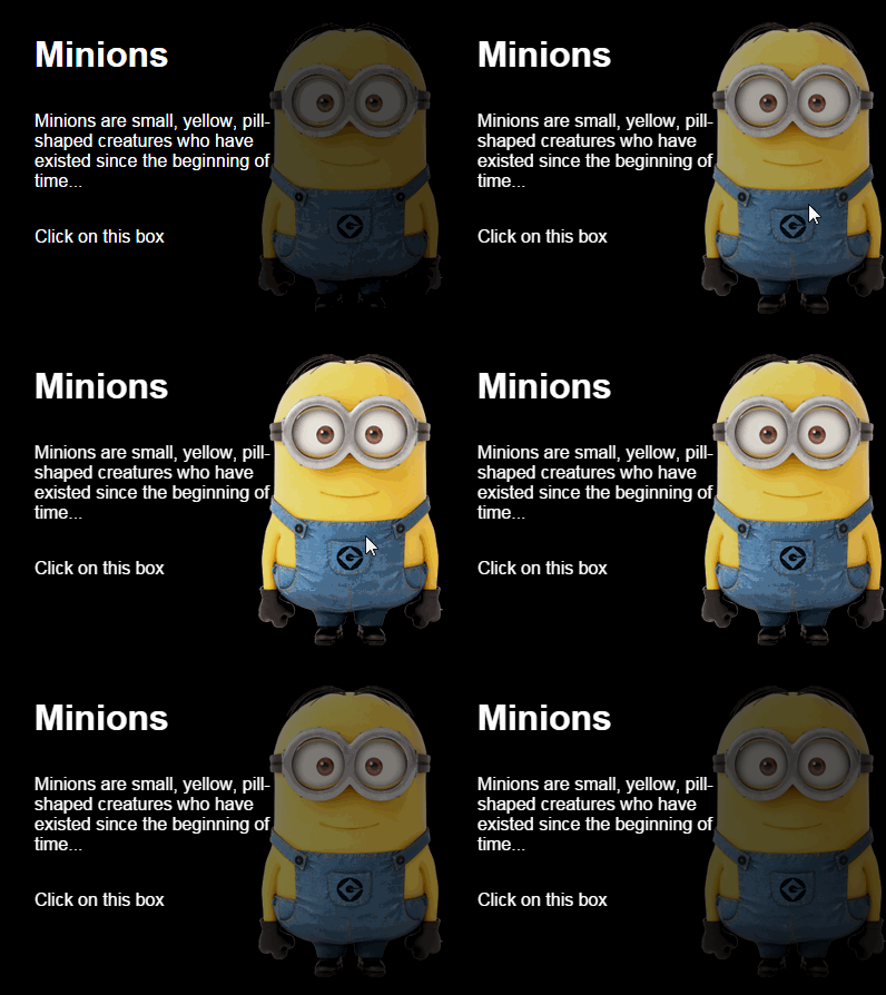
With this property, you can achieve many effects that weren’t easily possible until now. The most common one is the iOS blurred style effect:
.header {
    background-color: rgba(255,255,255,.6);
    backdrop-filter: blur(5px)
}
Every element behind the header is blurred by 5px. It's as simple as that.

In the demo, I use @supports in order to apply backdrop-filter along with small adjustments (background color and element's position) to keep a readable header in browsers with no support.
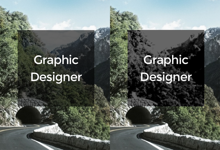
backdrop-filter can also improve readability of texts over images:
.text {
    backdrop-filter: blur(1px)
}
Combining multiple filters, you can create simple graphic effects, close to what CSS blend-modes offer:
.text {
    background: rgba(0,0,0,.6);
    backdrop-filter: grayscale(1) contrast(3) blur(1px);
}
Few things you should be aware of:
- the background of the element where
backdrop-filteris applied should be semi-transparent. Otherwise, you’ll never see the effect. - there's a bug when combining
backdrop-filterwith any properties that crop elements (egborder-radius,mask,clip-path, etc). This means advanced effects are not possible for now. backdrop-filtercreates a new stacking context, asopacitydoes- it can be animated
- as of now, this property is prefixed in Safari:
-webkit-backdrop-filter - there's a CanIUse page for support
filter()
Sometimes, you don't want to apply filters on the element, nor on the backdrop. You just want to apply filters on the background, but there's no background-filter property. This is where the filter() function may come in handy. The filter() function, not to be confused with the filter property, takes two parameters: an image and a filter, returning a new processing image. This image can then be used with any CSS property accepting images. Something like:
.element {
    background: filter(url(path/to/img.jpg), blur(5px));
}
As a result, you’re now able to apply filters to images before using them in backgrounds. You can think of it as a polyfill for background-filter (or background-opacity, background-blur, whatever), but it’s much more powerful.

The good news is that this function, even with no mention from Apple, is also supported in Safari 9.
See live result on JSBin (only Safari 9+)
Few things you should be aware of:
- the function is defined in the Filter Effects specification
- there's a bug with
background-size - it can be animated
- as of now, this function is prefixed in Safari:
-webkit-filter() - there's a CanIUse page for support
It's also worth mentioning that both backdrop-filter and filter() can be animated easily with CSS transitions or animations, or even with JavaScript.

I'm strongly looking forward to seeing browsers implement these filters features. SVG could do this as well, but such great effects can be done in a simplified way with CSS. From the past year, many CSS discussions were too much focused on architecture, methodologies & tools. It's good to remember that CSS is also everything about graphic design (along with SVG).
OK, support is less than minimal for now, but hey, these features will be available in millions of iPhones and iPads before the end of the year 2015. Just sayin'. :)
Edit: You can also learn how to fake backdrop-filter using element() function and/or SVG filters.