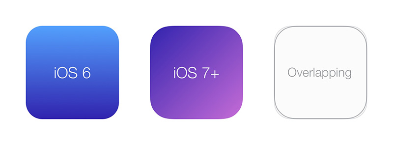
Recently, I’ve shared on Twitter an article about optical illusions in user interfaces. I love illusions, but that’s a new one to me: a modified circle can look more circular than a geometric one! And this is also true for rounded rectangles. Surprisingly enough, I also discovered that Apple is using this trick for all their icons since iOS7. Mathematically, it’s known as the Lamé Curve or Superellipse.

At the same time, I was experimenting with the Paint API from Houdini for a talk. This API defines a new way to draw content into a CSS <image> during the paint phase of the rendering engine. It basically gives the ability to programmatically draw an image to be used as a background for example. So, drawing a superellipse should be easy.
Few weeks later, Sketch released a new version and introduced “Smooth corners” feature which is, as far as I know, a superellipse. But I love the name, so let’s create smooth corners in CSS.
First, let’s add a new paintWorklet module1
(CSS.paintWorklet || paintWorklet).addModule('smooth-corners.js')Then, from this new loaded file, register a new paint called smooth-corners, with a paint method which is drawing a superellipse (algorithm from QT codebase):
registerPaint('smooth-corners', class {
  paint(ctx, size) {
    ctx.fillStyle = 'black'

    // n=4 draw a squircle
    const n = 4

    let m = n
    if (n > 100) m = 100
    if (n < 0.00000000001) m = 0.00000000001
    const r = size.width / 2
    const w = size.width / 2
    const h = size.height / 2

    ctx.beginPath();

    for (let i = 0; i < (2*r+1); i++) {
      const x = (i-r) + w
      const y = (Math.pow(Math.abs(Math.pow(r,m)-Math.pow(Math.abs(i-r),m)),1/m)) + h

      if (i == 0)
        ctx.moveTo(x, y)
      else
        ctx.lineTo(x, y)
    }

    for (let i = (2*r); i < (4*r+1); i++) {
      const x = (3*r-i) + w
      const y = (-Math.pow(Math.abs(Math.pow(r,m)-Math.pow(Math.abs(3*r-i),m)),1/m)) + h
      ctx.lineTo(x, y)
    }

    ctx.closePath()
    ctx.fill()
  }
})
Speaking about arguments of the paint method:
ctxis aPaintRenderingContext2Dobject, which is a subset ofCanvasRenderingContext2D, so you can (mostly) draw anything you wantsizeis aPaintSizeobject which is the size of the image to be drawn
Now, we can use it from CSS with the new paint() function. It will draw a black rounded rectangle with smooth corners
.el {
  background: paint(smooth-corners);
}
To keep things simple, we will use the generated image as a CSS mask2. That way, we can easily set background for colors, gradients or images.
.el {
  background: linear-gradient(deeppink, orangered);
  mask-image: paint(smooth-corners);
}
That’s nice, but not very reliable. Right now, we draw a specific superellipse named a squircle3, because the n variable is set to 4. So, how do we draw a superellipse with a different exponent? iOS icons use 5 for example. Let’s do it with CSS custom properties.
First, use a custom property --smooth-corners
.el {
  --smooth-corners: 4;
  background: linear-gradient(deeppink, orangered);
  mask-image: paint(smooth-corners);
}
And get value from registerPaint function
registerPaint('smooth-corners', class {
  static get inputProperties() {
      return [
          '--smooth-corners'
      ]
  }
  paint(ctx, size, styleMap) {
    const exp = styleMap.get('--smooth-corners').toString()

    const n = exp
  }
})
Note that the paint() method receives a third argument styleMap, which is an API to retreive computed value’s for properties listed in inputProperties. Here we get --smooth-corners value and use it for the n variable.
The full power now is that we can author --smooth-corners right from CSS, and property could even be animated if we register it using CSS.registerProperty (from CSS Houdini Properties & Values API).
For now, only Chrome4 supports the Paint API from Houdini, so we do progressive enhancement:
.el {
  border-radius: 60px;
  background: linear-gradient(...)
}

@supports (mask-image: paint(smooth-corners)) {
  .el.is-loaded {
    border-radius: 0;
    mask-image: paint(smooth-corners);
    --smooth-corners: 5;
  }
}
Also, as Houdini is JS-in-CSS, it’s better to wait for JavaScript to be loaded or ready. Here, I decided to add .is-loaded class to the element.
In production, we should be able to automate authored CSS with a PostCSS plugin for example.
Play with it IRL https://css-houdini.iamvdo.me/smooth-corners in a supported browser
Notes
Using a CSS mask basically masks everything outside of the box (it’s the purpose of a mask 😁). You should be able to draw a gradient or an image from the registerPaint if you need to (but it seems that <image> type is not yet well supported, so you have to deal with it for now).
If you want to experiment a bit, see other demos on how to draw an image: create your own background properties, like background-opacity or how to pass arguments instead of properties: draw a gradient from 4 corners. I will be happy to share your work!